Electoral Patterns in the US Elections

Working with US elections data is rather intimidating because it must be the most analyzed election in the history of humanity. Every possible way to visualize information has probably been explored already. Some interesting ones are on The Hindu, Al Jazeera, and Karim Douïeb’s 2019 animation. Luckily for me, I still had questions that were not answered, giving me a reason to work with this information. Besides, it had to be something other than a misleading map.

Right after the Indian General Elections in May 2024, I’d created this chart, visualizing Lok Sabha constituencies represented by different parties. In India, members of the Lok Sabha form a majority and go on to form the government. The chart helped capture an entire era of Indian democracy, and highlighted interesting stories.
The broad equivalent idea for the US is the way the electoral college functions.
Quick description of the electoral college for the uninitiated:
Every state gets a fixed number of electoral college votes. The electors of the state are expected to cast their votes for the president based on the majority vote in their state. There are some exceptions to this rule, where electors may vote for different candidates than the majority voters. This is termed faithless voting. If this doesn’t sound like a real election to you, I understand, but them’s the rules of this game!
The context (of all in which you live and what came before you..)
Zooming out of the current election cycle can help take in the broader context of the country’s voting patterns. Take a look at the last fifteen elections, visualized by electoral college votes:
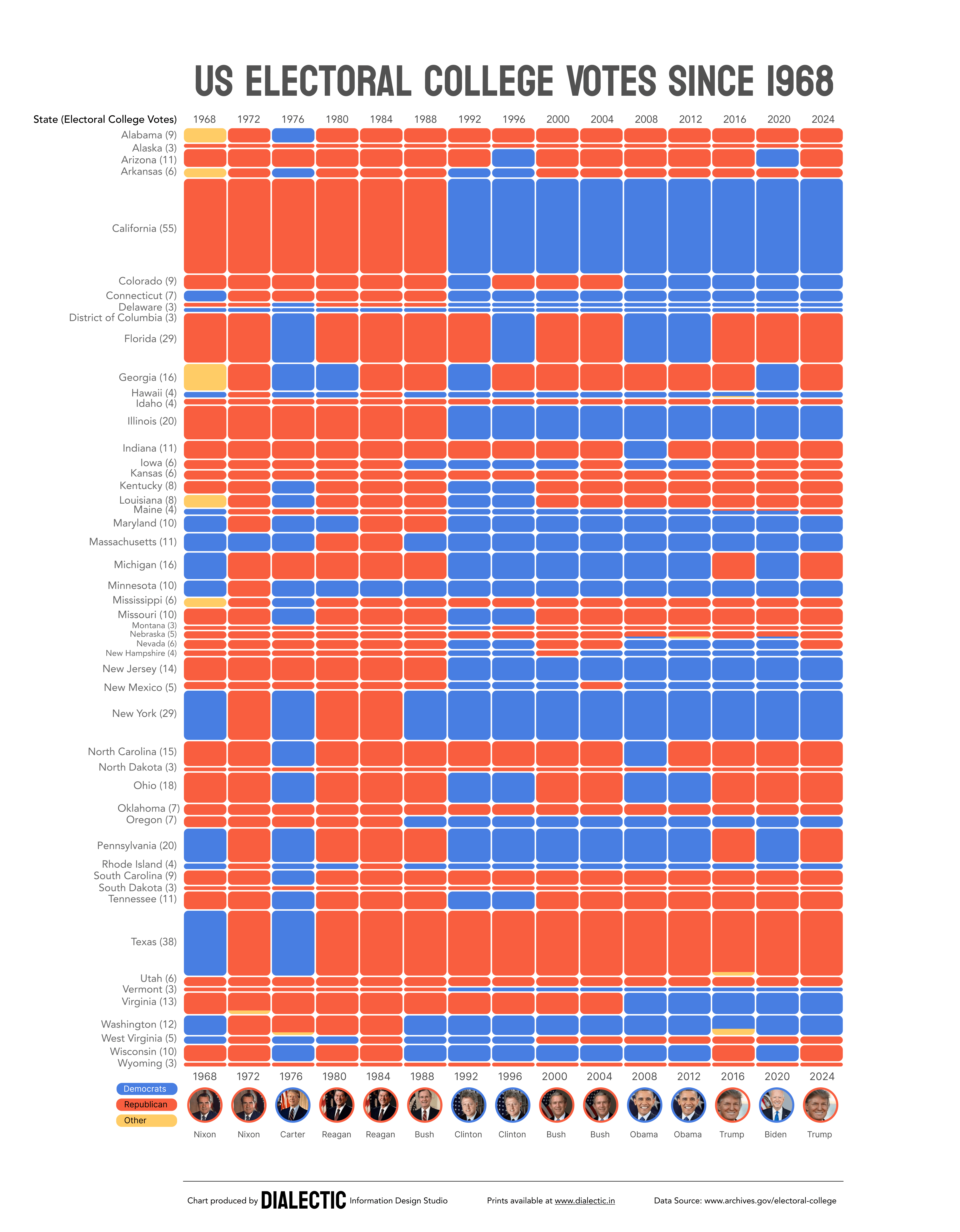
Each of these rectangles represent the voices of millions of voters who want different things, and sometimes it’s a very close margin at the state level. Ultimately, results are not deduced from the popular vote, but from this tally of electoral college votes.
You might have noticed there are some blue and red zones. To zoom into that angle of analysis, here’s another chart that separates states based on their partisan affinities. For the elections of 2024, there were 7 states considered swing states, or key battleground states.
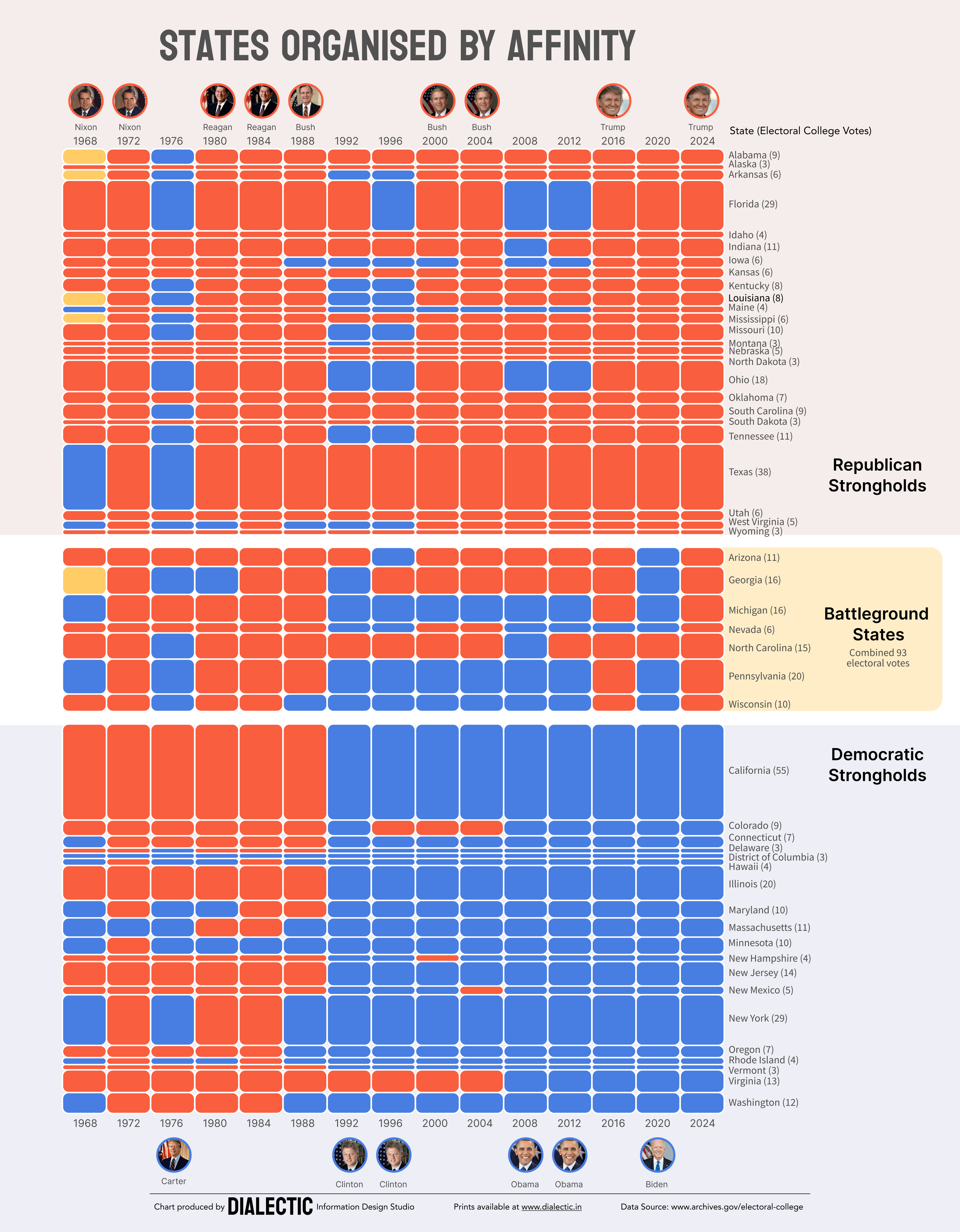
If this country feels ‘divided’, it’s been that way for a while, all but a natural consequence of the way the system is set up. The barriers to entry for a third party are sky-high, leaving the country with only two realistic choices.
Loyalty
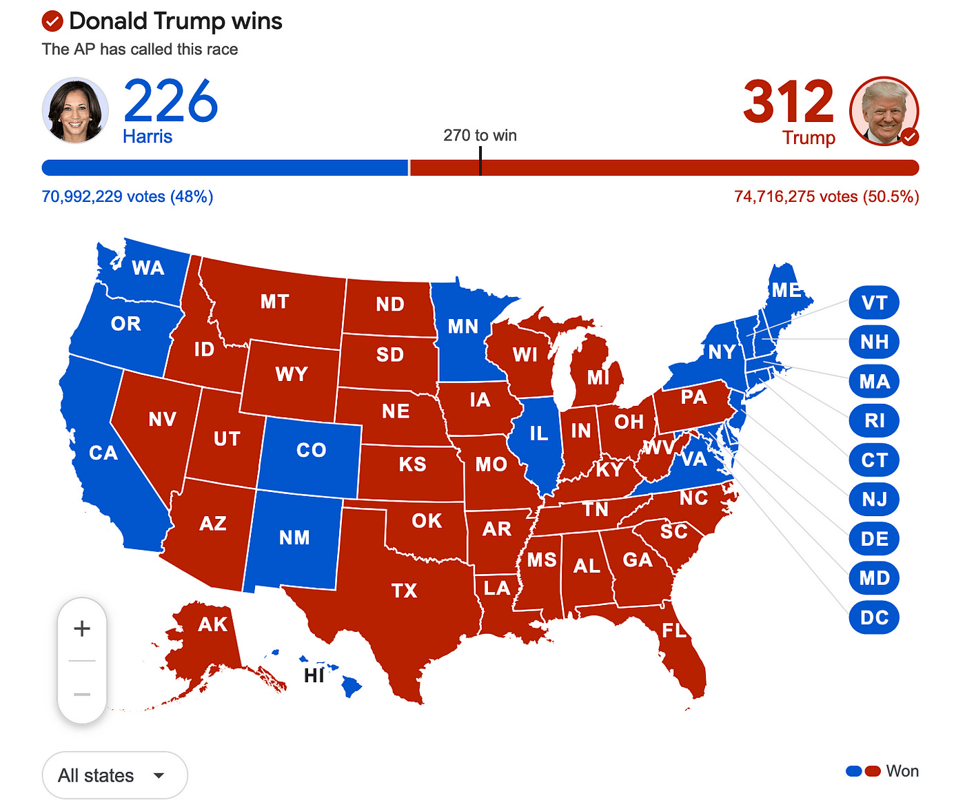
What is surprising to me, however, is the loyalty of some states. There are several states (Alaska, Idaho, Kansas, Nebraska, Utah, North and South Dakota, Oklahoma, Wyoming) that have only ever voted red, consistently over 15 elections. There’s only one (Washington, D.C.) that has done the same for the Democrats. You know where there are on this all too familiar map:
Why does this analysis start with 1968?
It was not until the passing of the Voting Rights Act in 1965 that the United States could have universal adult franchise. The act outlaws the notorious “literacy tests” and other tools that were used to discriminate against Black voters, and protects the voting rights of all citizens. Elections before this time were pseudo-democratic exercises at best. Call it my minor act of resistance, but in my books, the US only joined the league of real democracies in 1968.
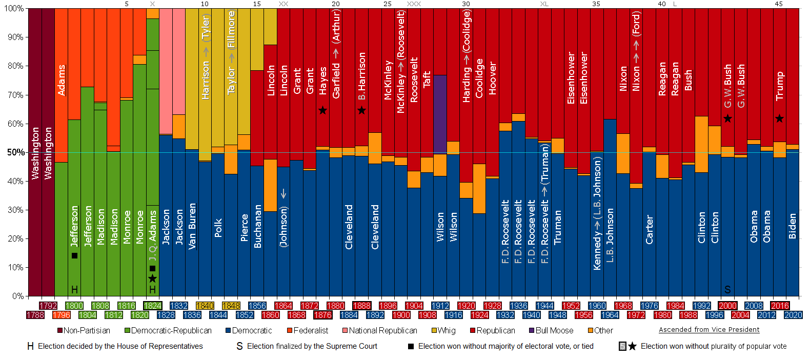
For a broader overview of those preceding years, here’s a useful chart visualizing popular vote share since 1788.